1 Introduction
The raw-refined sugar spread, SB vs QW, is one of our bread and butter processing margin trades. Raw sugar in the form of sugar cane or beets have to be refined to get the normal white sugar we are all used to. In the Sugar Trading Manual - Cost of production the author adds a fixed cost of USD 65/t which equates to their estimate of the world average cost of upgrading raw sugar to refined sugar in autonomous refinerries.
In the following decrease this cost down to USD 50/t to create a price range where processors will find it difficult to create a profit from refining raw sugar. The plot below shows the time evolution of the SB vs QW spread since 1990. This high pressure region of USD 50-65/t is highlighter by the blue shaded region.
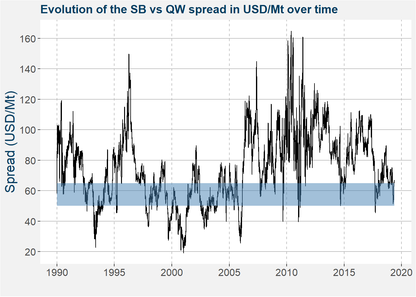
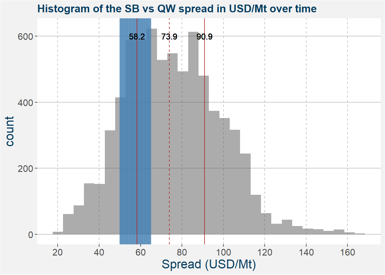
Below we represent the same data as above in the form of a histogram. The high pressure processing margin region is highlighted in blue. Superimposed on top of the histogram we show lines representing the 25th, 50th (median) and 75th percentiles together with the values given by the text centered over the lines. Notice that the pressure region coincides with the 25th percentile.
We are interested in this trade when the SB vs QW spread is below USD 55. Here your sugar refineries will be hard pressed to make money. The lack of refining will force raw sugar supplies to increase. This causes a decrease in the raw sugar price and forces the raw sugar curve to become more contango. Similarly, the lack of refining causes decreases in the refined sugar stock which forces the prices upward and pushes the refined sugar to become more backwardated.
In order to extract a profit from such a scenario we take up long exposure in refined sugar (QW) and short exposure in raw sugar (SB). This trade behaves particularly well because of the favourable curve structure that arises in these situations. When the short position is in cantango and the long position is backwardated you can generate a roll return by just holding the trade. If there is a normalisation in the processing margin then this trade gains from the correction in the spread as well as the return from rolling the position forward.
2 Roll Adjusted Prices
To understand the effect of the roll yield on the profits from trading a spread we need to first understand how to construct a roll adjusted futures time series. The table below shows the roll schedule we use for trading the front side of the SB vs QW spread. As an example, during January we will be in the SB H and QW K contracts respectively. During February we roll the SB H forward to K, but keep the QW exposure in K. Similarly during March we roll the QW forward to Q while SB remains in K. Throughout we consider prices in units of USD/Mt (USD /t).
When the curve is in backwardation the cummulative roll adjustment curve has a positive (bottom left to top right) slope. The converse holds when the curve is in contango. Consider the top facet showing the price data for refined sugar (QW). Notice that the cummulative roll adjustment curve has a positive slope for the majority of times. Hence the futures curve was in backwardation for the majority of times. This forces the roll adjusted price donward by a value equal to the cummulative roll adjustement at each timestep.
| SB | QW | |
|---|---|---|
| Jan | H | K |
| Feb | K | K |
| Mar | K | Q |
| Apr | N | Q |
| May | N | Q |
| Jun | V | V |
| Jul | V | V |
| Aug | V | Z |
| Sep | H | Z |
| Oct | H | H |
| Nov | H | H |
| Dec | H | H |
The plot below shows the unadjusted and roll adjusted prices in blue and green respectively. The cummulative roll adjustment is given by the red curve. These cummulative values make up the cummulative sum of the discontinuities or jumps in the futures price series when we roll forward. We prefer to use a backwards roll adjusted price series because this forces the latest price data to coincide with the roll adjusted values.
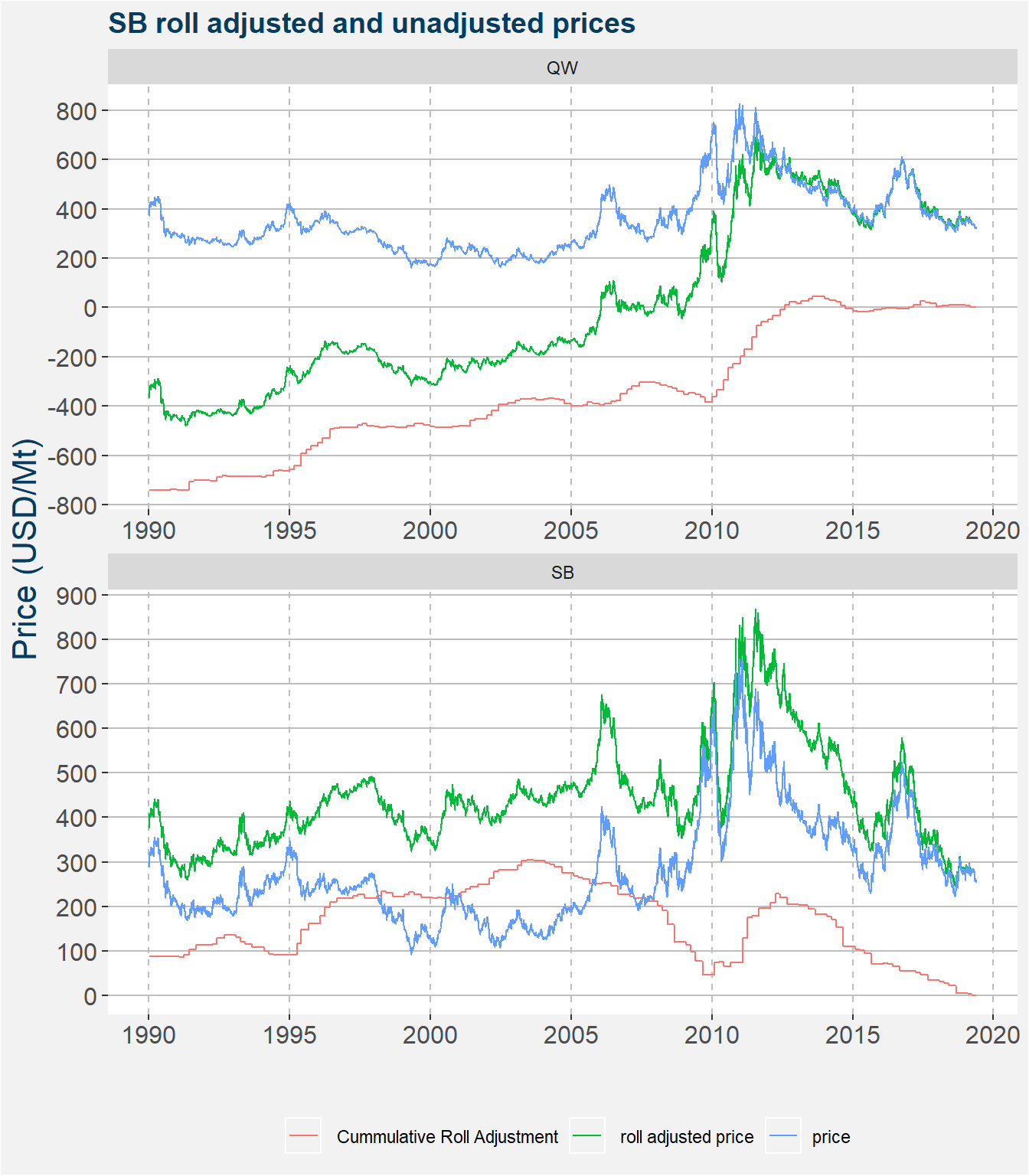
The cummulative roll adjusted values for the raw sugar price data shown in the botton facet has a mixure of positive and negative slopes, however the general trend is downward. This downward trend implies the the curve must have been in contango for prolonged periods of time. This cummulative rolll adjustment forces the roll adjusted prices upward. This can be seen in the bottom facet of the plot above by the green curve being higher than the blue curve. Notice that the magnitude of the cummulative roll adjustments for QW is much greater than that of SB. This implies that QW will have a much greater impact on how the structure rolls forward.
For more detail on this we direct the interested reader to this white paper the Campbell & Company published in the hedge fund journal.
3 The Role of Roll Yield
In the plot below we show the value of a USD 1 investment since January 1990 in the SB vs QW spread. Throughout we assume a long position in QW and a short position in SB. Because of the size of the underlying contracts we trade the spread in a one-to-one ratio. The black line in the plot below shows the value of the the USD 1 investment. We do not include trading costs or slippage in the calculations below. The blue curve shows the difference in cummulative roll adjusted values. We define this quantity as the roll yield.

Notice that the form the USD 1 investment roughly follows the shape of the roll yield. We postulate that the long term return profile of any fundamentally paired relative value spread is directly proportional to the roll yield as defined above. The oscillations about this trend arise from the movement in the spread itself. If these oscillations in the spread outweigh the possible gains from the roll yield a long position in the spread, i.e. long QW and short SB, does not make sense.
The table below shows the values of the calendar spreads to which we will roll each of the commodities if we were to roll on the date shown. Notice that both calendars are negative, that is, both the curves are in contango. As a reminder, here the units are USD /t. Notice that SB is in a slightly greater contango than QW.
| date | commodity | active | next | calendar |
|---|---|---|---|---|
| 2019-05-22 | QW | QW_Q_2019 | QW_V_2019 | -4.8 |
| 2019-05-22 | SB | SB_N_2019 | SB_V_2019 | -9.26 |
The roll yield is calculated as
\[ \text{Roll Yield} = \text{long leg calendar} - \text{short leg calendar}. \]
Currently this is a small positive number USD 4.46/t. Here the shape of the curve gives upward pressure to the spread.
4 Sugar Spread Volatility vs Roll Yield
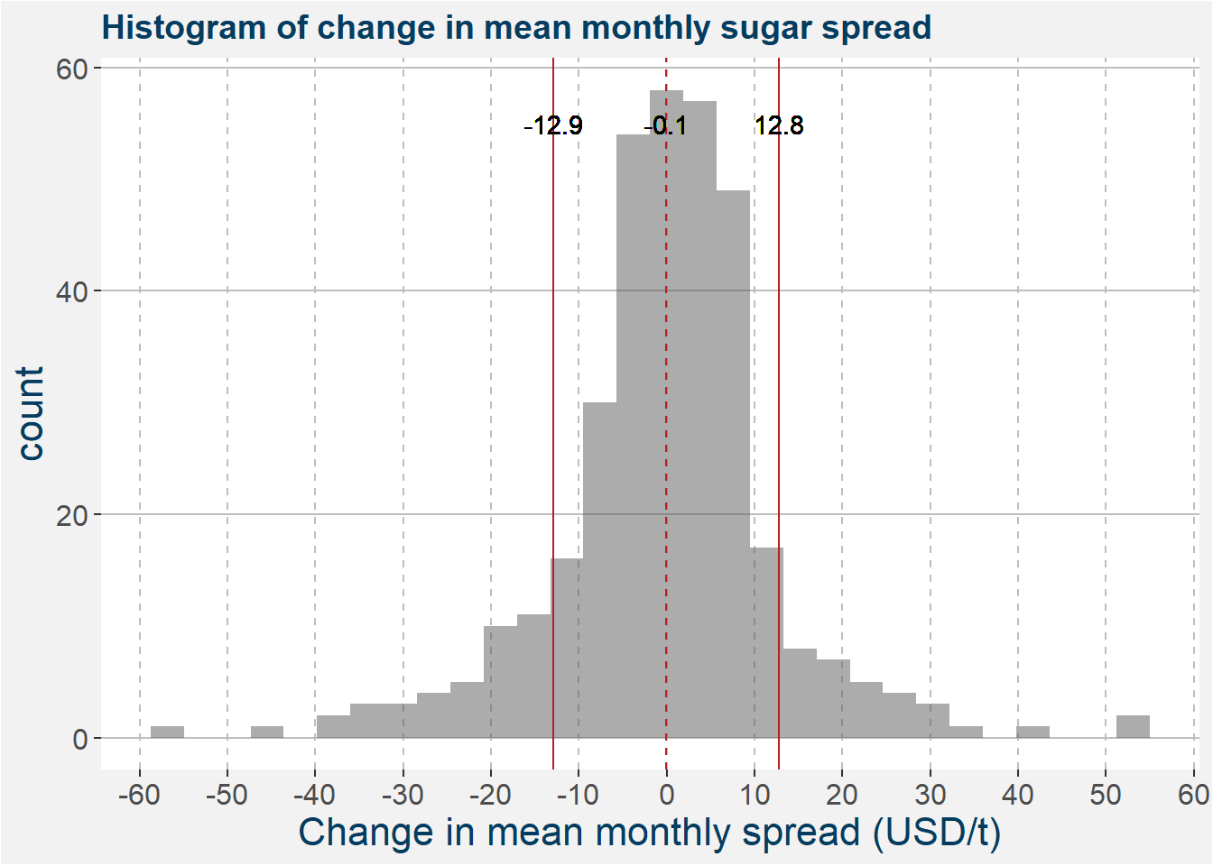
In this section we want to compare the month to month change in the the SB vs QW spead in USD/t terms to the force applied by the curve structure. The plot below shows a histogram of the change in mean monthly spreads. The vertical superimposed lines show the mean and one standard deviation away from the mean respectively.
The plot below shows a histogram of the difference in roll yield, i.e. the monthly changes in the cummulative rolls of the two underlying commodities. Similar to above we superimpose vertical lines showing mean and one standard deviation away from the mean.
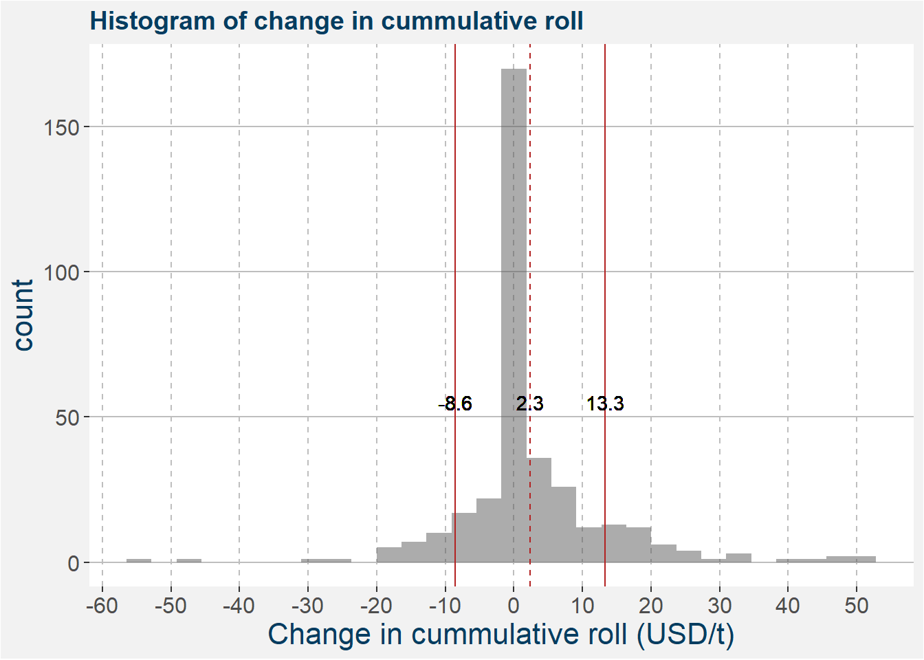
Comparing the statistics of the two distributions we can see that, on average, the roll effect outweights the monthly changes in the SB vs QW spread.
5 Remarks
- Raw vs refined sugar has a quantifiable downside determined by the processing margin to create refined sugar from the raw inputs
- Historically, the effect of the roll dominates the monthly variably in the spread
- The roll structure dominates the performance of the strategy
- When the spread is suppressed and gives a positive roll it signals the best entry point